
koi food truck
the izakaya on wheels
Timeline: 3 weeks | Collaborators: Ellie Tanaka & Vivian Wong
Roles: Branding, Illustration, Packaging
Skills: Adobe Illustrator, Adobe Photoshop
itadakimasu! (let’s eat)
Koi is a product of the growing popularity of izakayas (Japanese pubs) and the trendiness of food trucks. The brand evokes the laid back, casual, and friendly feel of traditional izakayas along with Japanese aesthetics to be authentic and approachable.
order up
the challenge
The growth of food truck culture has every parking lot and loading zone filled with trucks during lunch hour or after hours outside of clubs and bars. Create a food truck around one of the top-five food trends with branding that will stand out in the crowd.
our solution
In Japanese culture, the Koi is a symbol of good luck, abundance, and perseverance. The logo design, scale pattern, and color palette are inspired by the Koi streamers (Koinobori) that are flown on Children's Day in Japan.
appetizers

mood board
We pulled our color palette and pattern from the Koinobori (carp streamer) that represents the head of the household. for photography style we took inspiration from Japanese pub food photography.
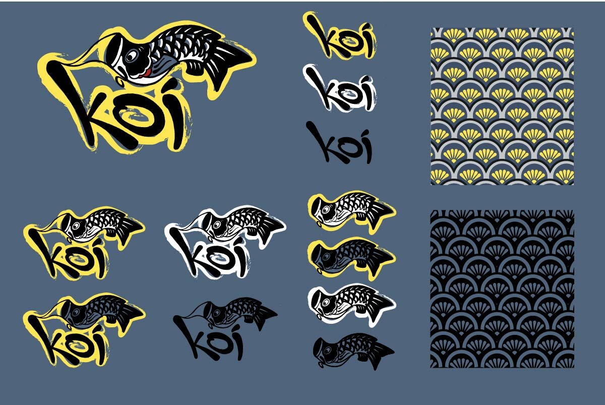
logo and pattern
These are the various lock-up and color variations of the logo as well as the scale pattern.

hand lettering and illustrations
The hand lettering for the headers and the illustrations are drawn to imitate Japanese calligraphy.
the main course
This stylized truck will definitely stand out.

Sides
We wanted the packaging to be economical and eye-catching. Everything is printed on kraft paper, uses one color ink, and are compostable to be kind to the earth and the and production costs.


dessert
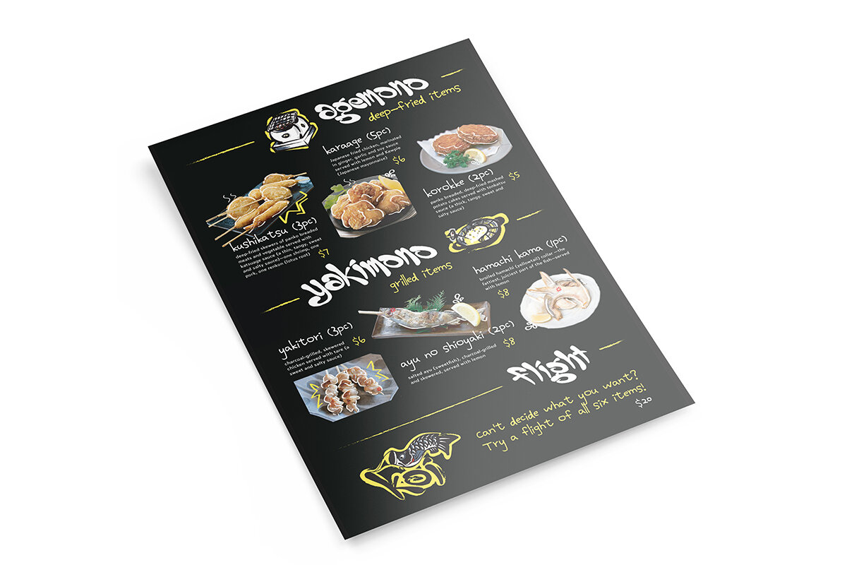
Menu Flyers
Uniformleftovers
Sketching and brainstorming are my favorite parts of the design process. I get to nerd out and draw, throwing as much as I can on the wall and see what sticks. While doing our initial research for Koi, we noticed that many izakayas use hand-written signs and menus. We wanted to bring that into the brand, so all the hand lettering and illustrations imitate Japanese calligraphy to give that authentic izakaya experience.


